A new ordering experience
A tasty opportunity.
Burger King has always been committed to enhancing the dining experience within its restaurants. As digital habits evolved, the company wanted to integrate the speed of mobile ordering into the physical restaurant. The goal was clear: allow customers to skip the counter and order directly to their table via the app.
Less waiting, more flavor.
Burger King sought to redefine the fast-food dining experience by bridging the gap between digital convenience and physical service. The goal was to reduce waiting times by allowing customers to order directly from their tables via the app, merging the speed of mobile ordering with the comfort of dine-in.
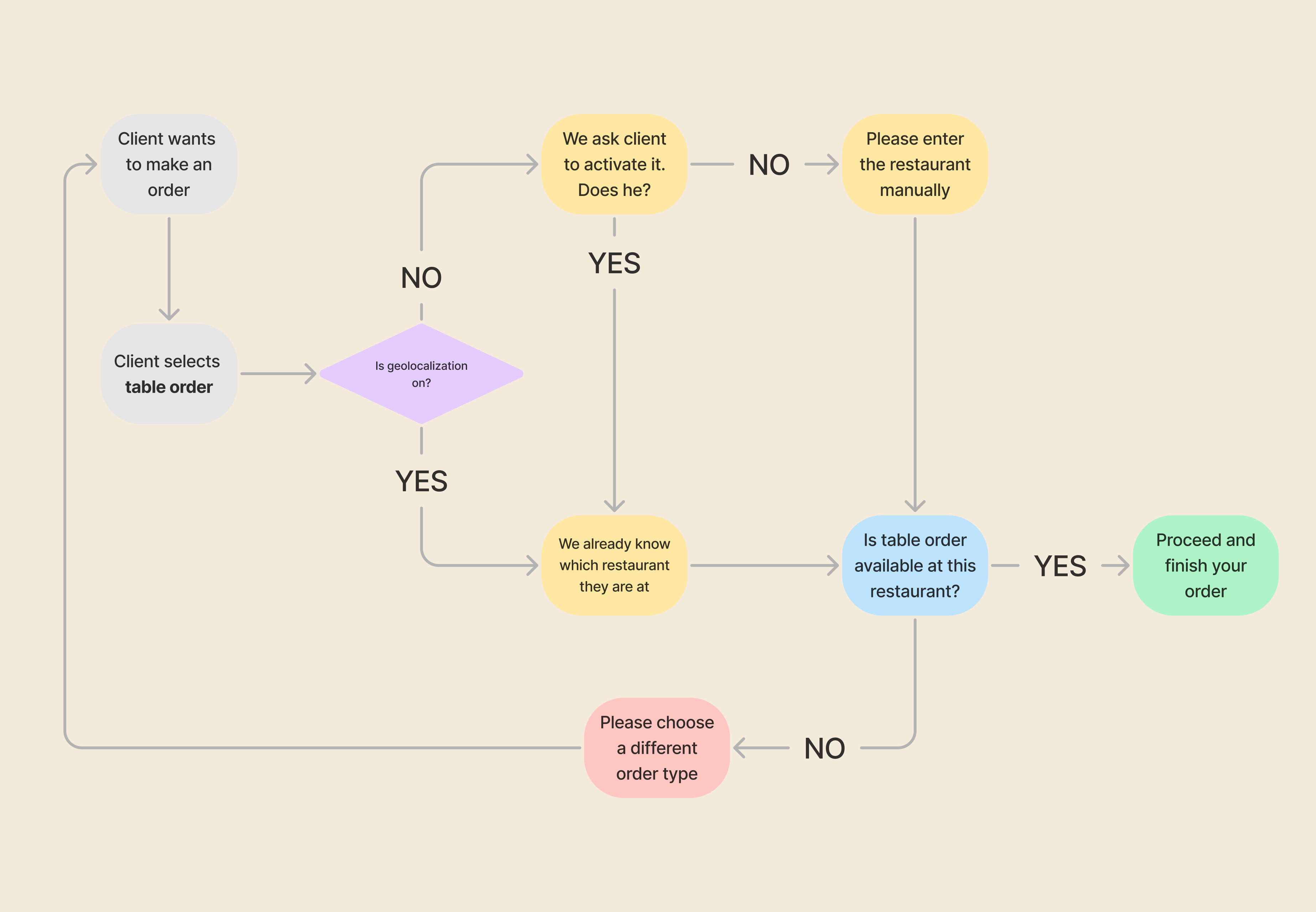
Skipping the line, not user privacy.
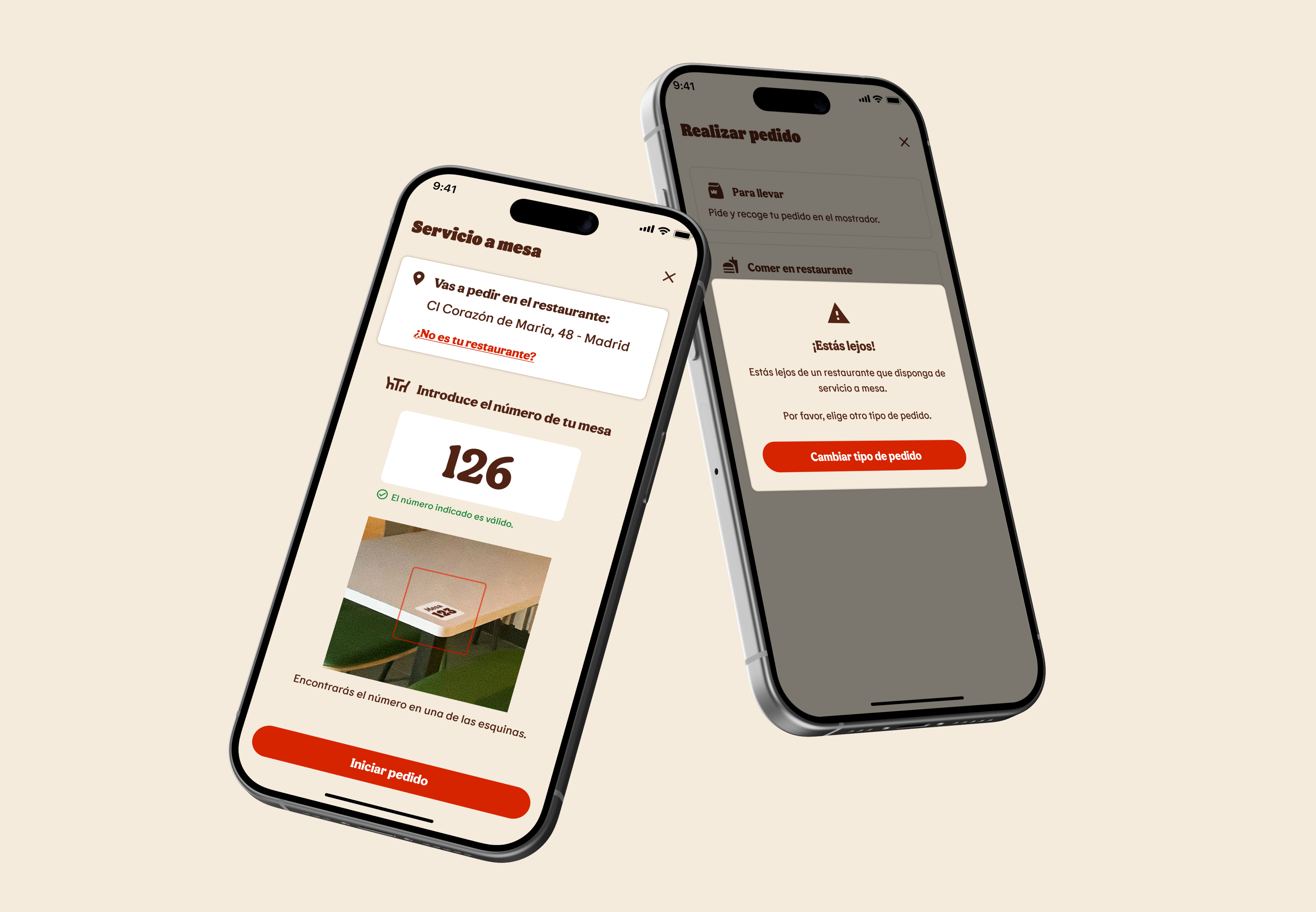
Verifying the user's physical presence in the restaurant was mandatory for the correct
operational working of the feature, and for that reason location services had to be
requested. The challenge was to ask users for location permission without feeling
intrusive.
To do so, we gave vital importance to content design,
explaining to the user why location was necessary and clarifying its real purpose in different UI
elements during the process.
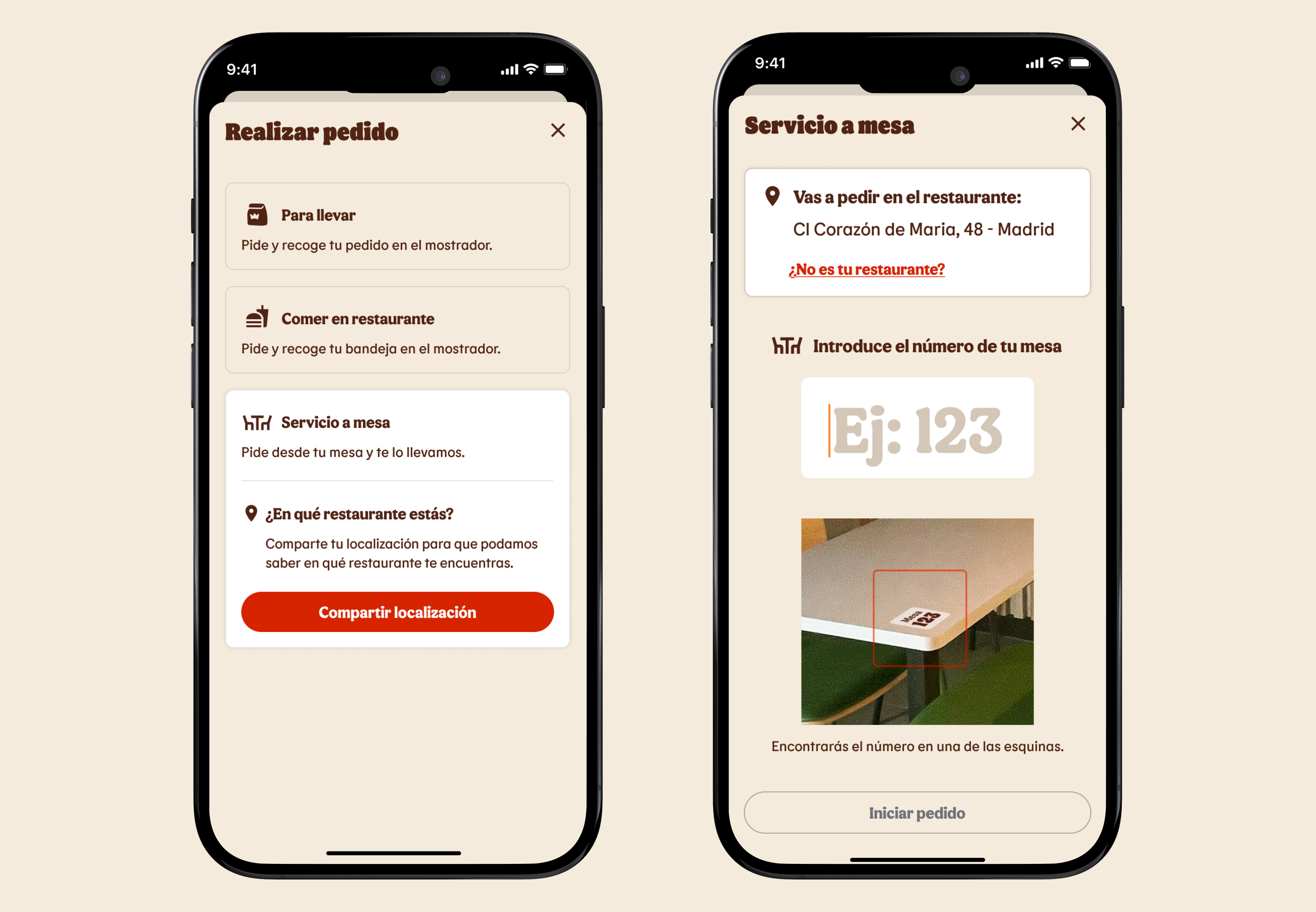
Your Whopper in just a few taps.
Working alongside the logistics department, we designed a new flow to place orders at
your table by adding a QR code to each restaurant table that allows the app to locate the user
in the restaurant and proceed with the
table ordering experience.
While it may sound like a simple solution, what we
managed was to skip the need for the customer to go anywhere else in the
restaurant and
instead be able to go directly to the table they want, only to find that they don't have
to move again to be able to order and receive their food.
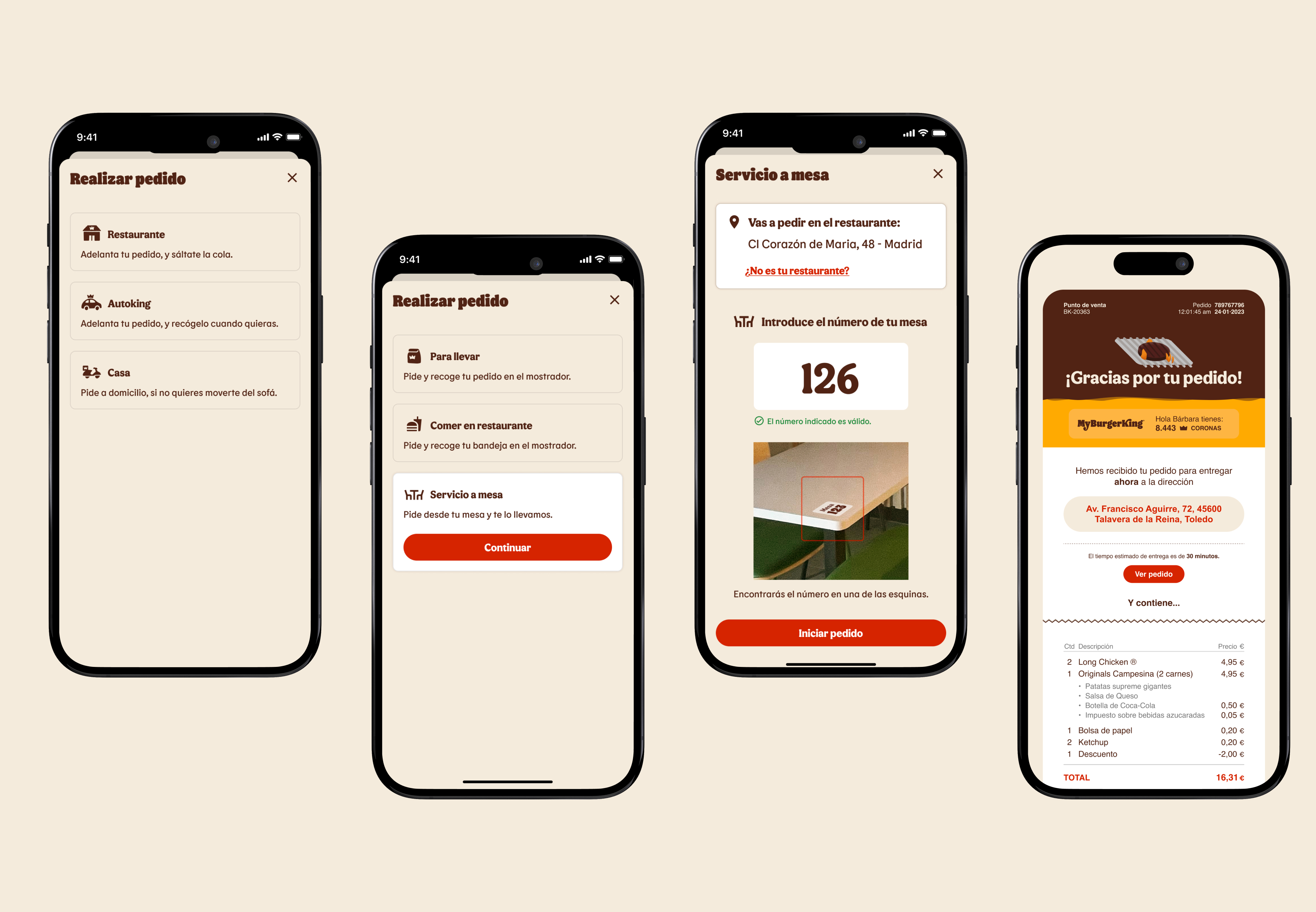
Ordering: make it fast, make it easy.
Aiming to integrate "table service" seamlessly alongside
existing
ordering flows like delivery, pickup, and kiosk, we conducted in-field research on a
restaurant during off-hours to validate typical friction points and map out the
entire user journey on the different ordering methods.
The result is an
intuitive, optimized UI that
turns complex logistics and different dining methods into a cohesive experience and
makes each method feel like they belong to the same app.
Think, solve, deliver. To your table, too.
As part of the product design team, I collaborated with stakeholders and logistics to define how
the new
app's "table ordering" method would work and look.
During development, we realized that
rethinking the ordering flows
would help to seamlessly integrate this new feature while significantly improving the overall
ordering
process, so we took the
opportunity to also enhance the ordering experience across all processes
beyond
just
adding the new "table ordering"
method.
Hungry for success.
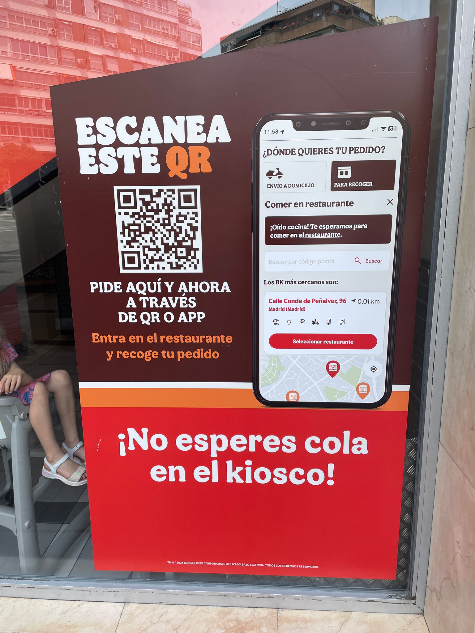
The feature was a resounding success, leading to a nationwide rollout with heavy in-store promotion highlighting the ease of use and the added value of skipping lines when ordering directly from your table. The feature quickly gained traction, increased in-restaurant app usage, and operational efficiency solidifying its value to the business.
Find opportunities for extra value. Then add on top.
At first, adding another ordering option on top of the existing ones felt overwhelming for users. However, a shift in mindset proved key: it became an opportunity not only to introduce the new method, but also to optimize the existing flows.
The result was an experience that proved more usable, faster, and with higher conversion, making users' lives easier while improving efficiency and profitability on the business side.
What initially felt like another stone in our path, thanks to a change in our mindset turned out to be a great opportunity to improve the overall experience.
First, understand what the user needs. Truly.
The starting point was clear: users want to get their food as fast as possible, without anything getting in the way. Once we established that mantra, the rest of the project felt already in a proper course.
However, while we did receive some data after the project, I would have loved to be able to access more detailed business metrics to actually see how the improvements impacted the user's experience, explore trends and understand behavior, tasks that I hope to be able to tackle in future projects.
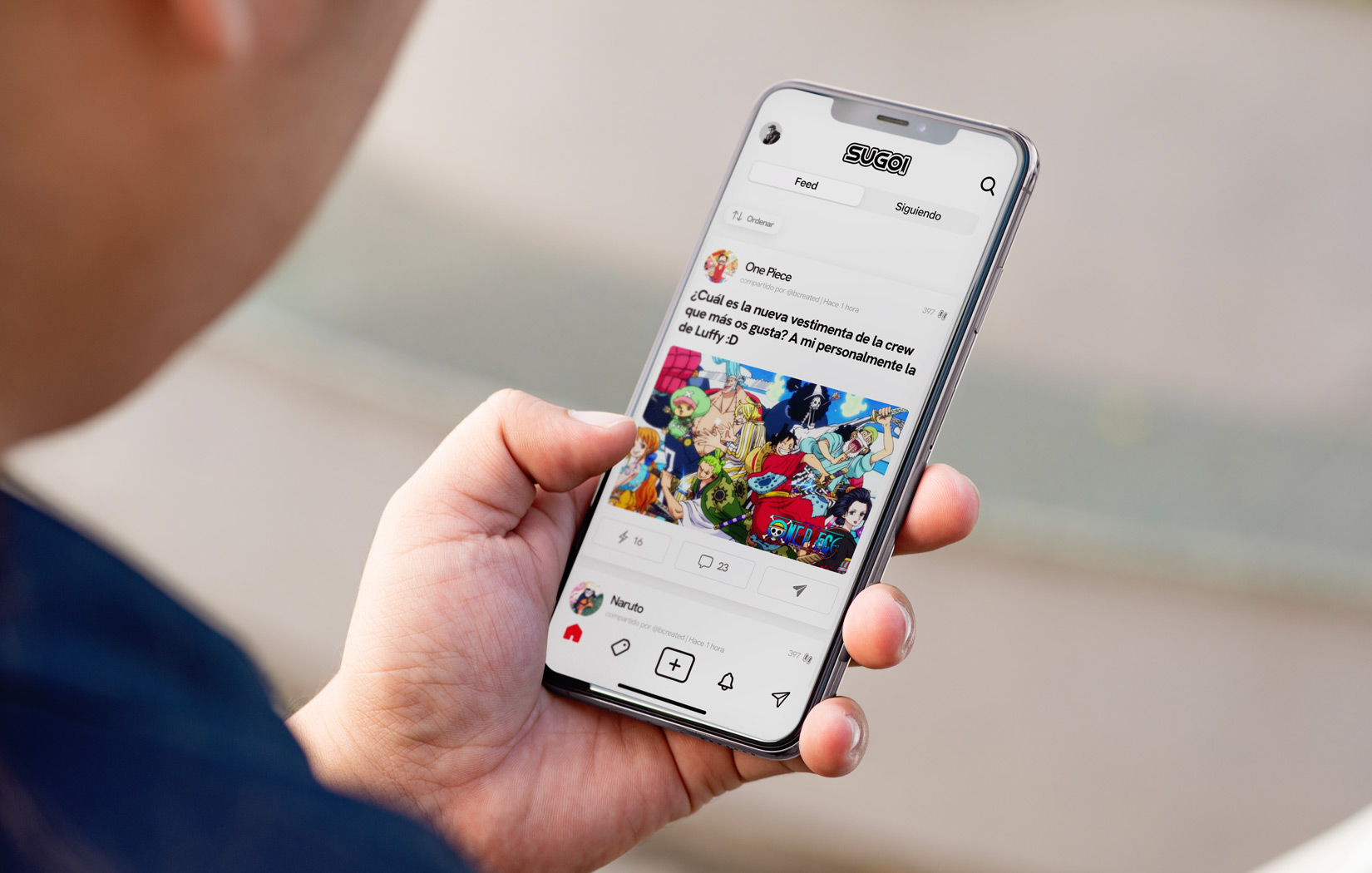

SUGOI: An award-winning manga app
Discover my side project, where I'm leading a team to launch a startup that aims to revolutionize the connection of fans with manga and anime from your pocket.
 VIEW PROJECT